+ BRAND IDENTITY + STRATEGY + WEBSITE
+ WINTER | 2024
+ HEALTHCARE
+ LOGO SUITE, INVESTOR DECK, WEBSITE
Visit Website
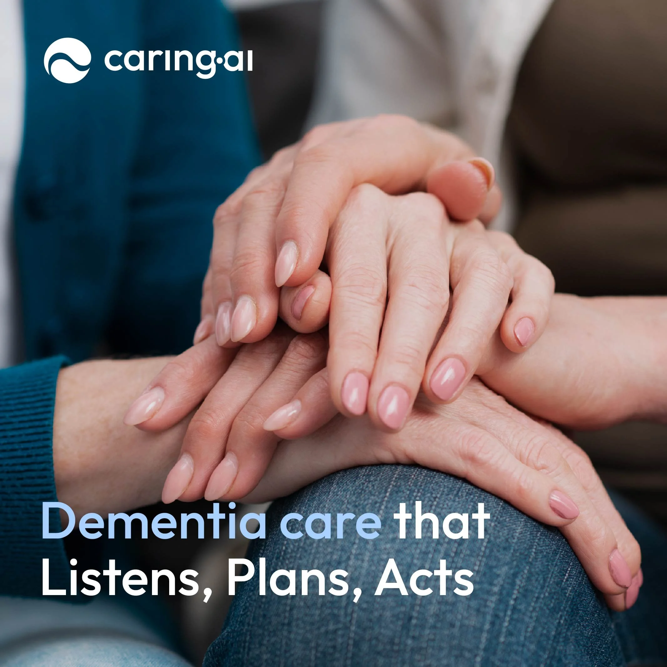
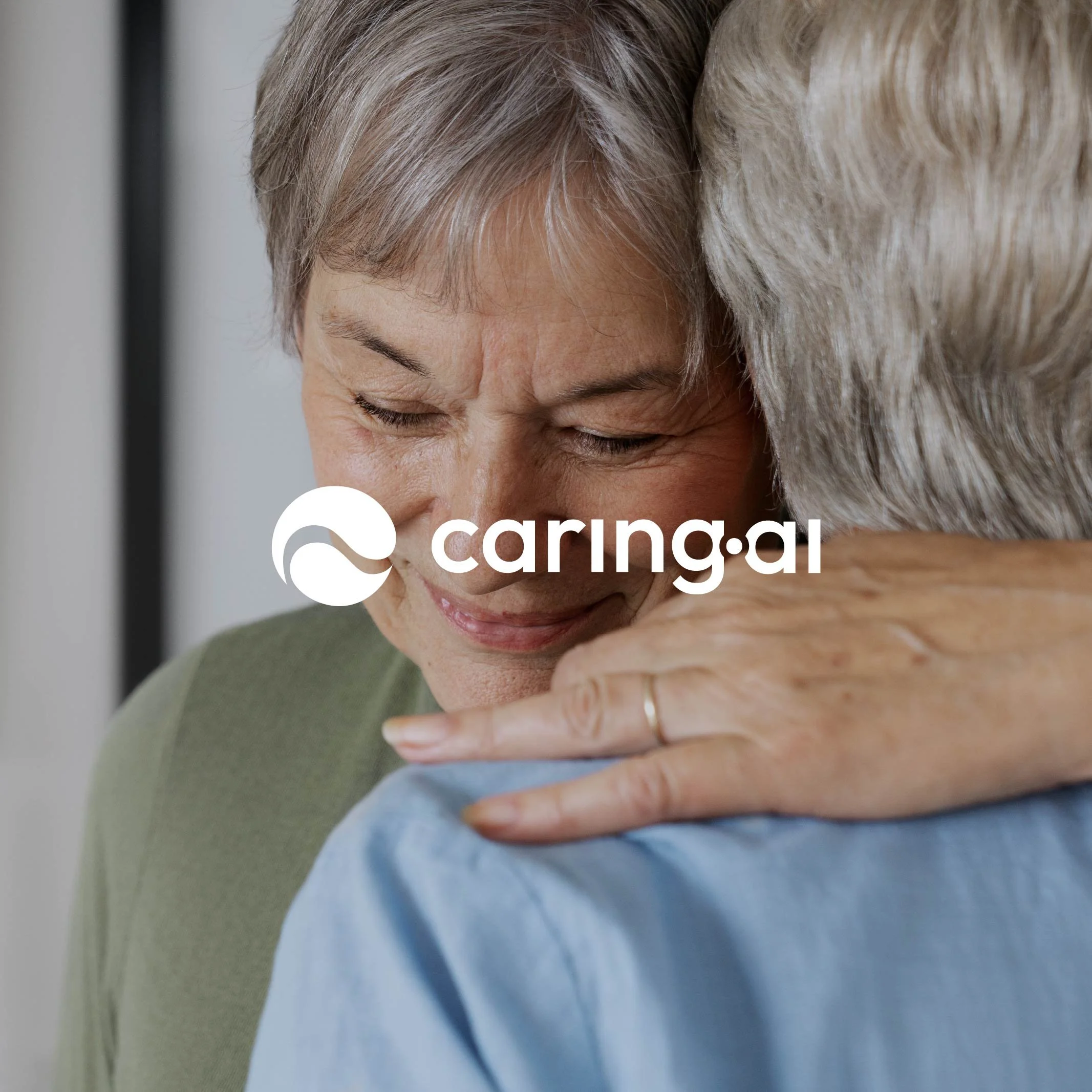
CaringAI
CaringAI helps physicians and families detect cognitive decline earlier and support loved ones with dignity and impact. Leveraging AI, CaringAI transforms the Dementia care through scalable screening, intelligent care plans, and expert navigation that helps physician’s workload. CaringAI offers three ways to help: CaringAI Listen, CaringAI Plan and CaringAI Act.
The design process
With every brand design project we have the client fill out a design brief to go over the brands values, target audience, goals. I take this information and conduct a competitor analysis to see how we can differentiate the brand in the competitive landscape.
CaringAI’s main goal was to provide a cognitive health technology company that empowers physicians and healthcare systems neuro cognitive screenings, assessments and care plans to patients. Care is support. Care is assessing. Care is planning, coordinating, advocating and educating. At CaringAI we are listening and it’s time to do more caring.
Knowing the goal of the brand we collaborated and identified the brands vision and mission. CaringAI’s core mission is to leverage AI in cognitive health and empower Dementia care for more patients and detect early.
Given these mission and goals we wanted to create a brand that provides hope: we aim to empower, dignity: we see humans not a condition, clarity: we’re brining the best technology has to offer to help individuals have the opportunity to see and select the best path forward.

Based on the brand strategy being defined we now draft directions of the brand tone and visual direction.
MoodboardBRAND WORDSEmpower
Calm
Approachable
Helpful
First Round of Logos
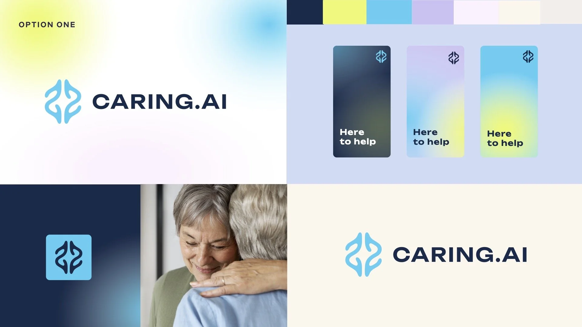
Option One
This version was modern and more clinical, with a symbol representing a brain. However, it didn’t feel aligned with the brand’s human-centered focus.
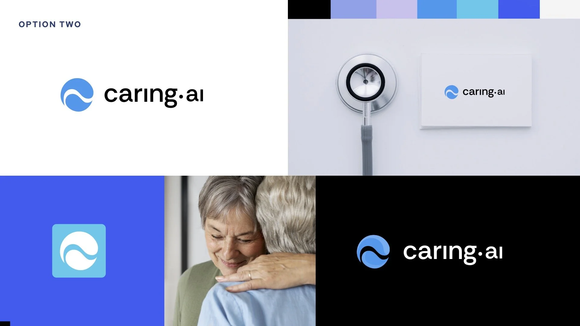
Option Two
This option was closer to hitting all brand values and tone out of all the options shown. We decided to expand upon this version and fine tune it a bit more.
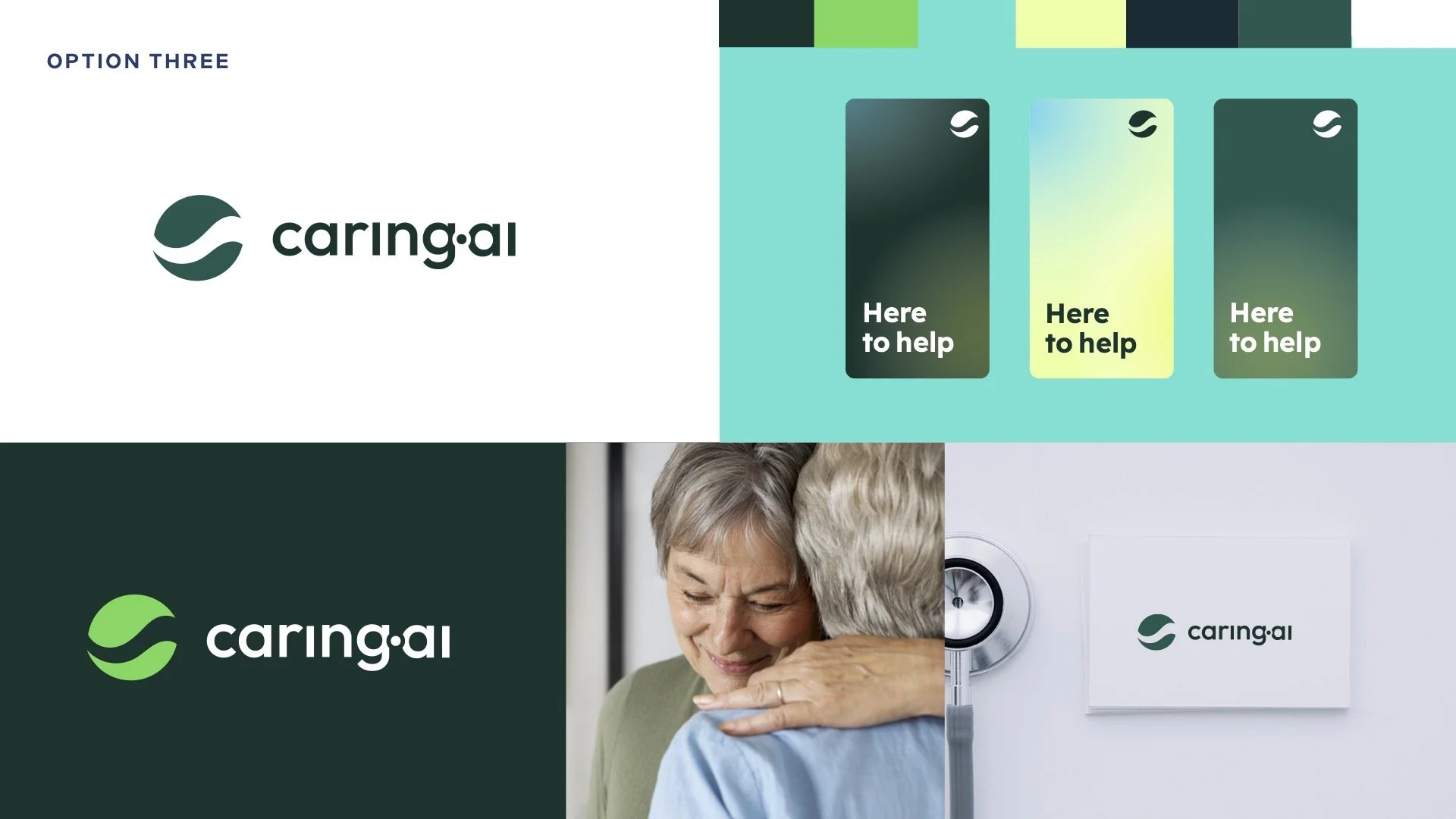
Option Three
This option features the wordmark we wanted to use, combined with the symbol from Version 2, as it better conveys the caring nature of the brand and symbolically represents abstract hands.
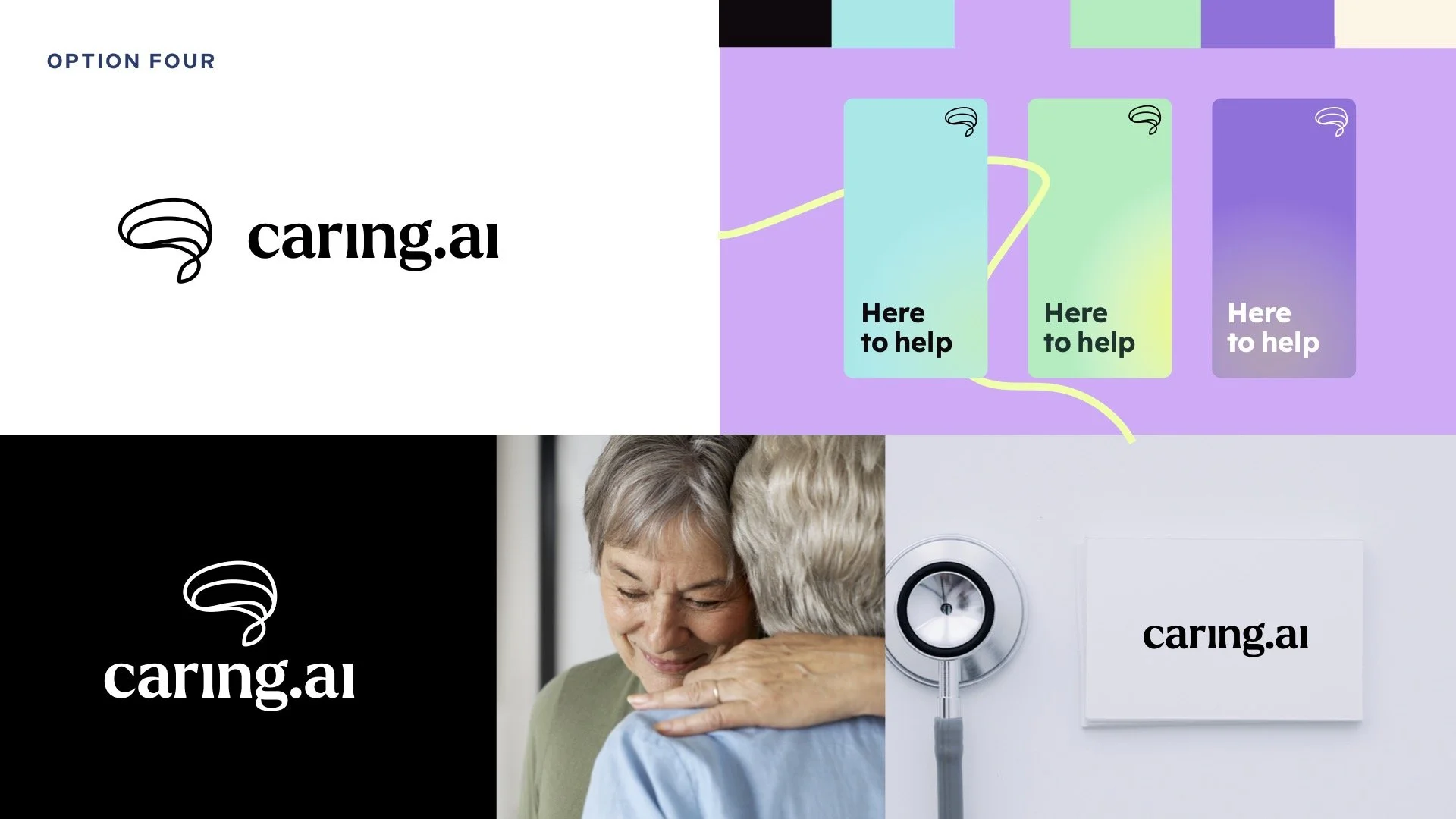
Option Four
This version captured the friendly and approachable qualities of the brand. While the symbol represented an abstract brain, it felt too clinical and less aligned with the brand’s caring nature.
Final Logo