+ BRAND IDENTITY + STRATEGY
+ WINTER | 2024
+ IT SERVICE TICKET DATA
Untrap
Untrap is an intelligence company that extracts critical business information trapped within clients’ internal systems, primarily IT service ticket data.
The design process
With every brand design project we have the client fill out a design brief to go over the brands values, target audience, goals. I take this information and conduct a competitor analysis to see how we can differentiate the brand in the competitive landscape.
Untrap should be perceived as a thought leader in data analytics and a trusted advisor to IT leaders. We want to be seen as a company that delivers exceptional value and drives tangible business results.
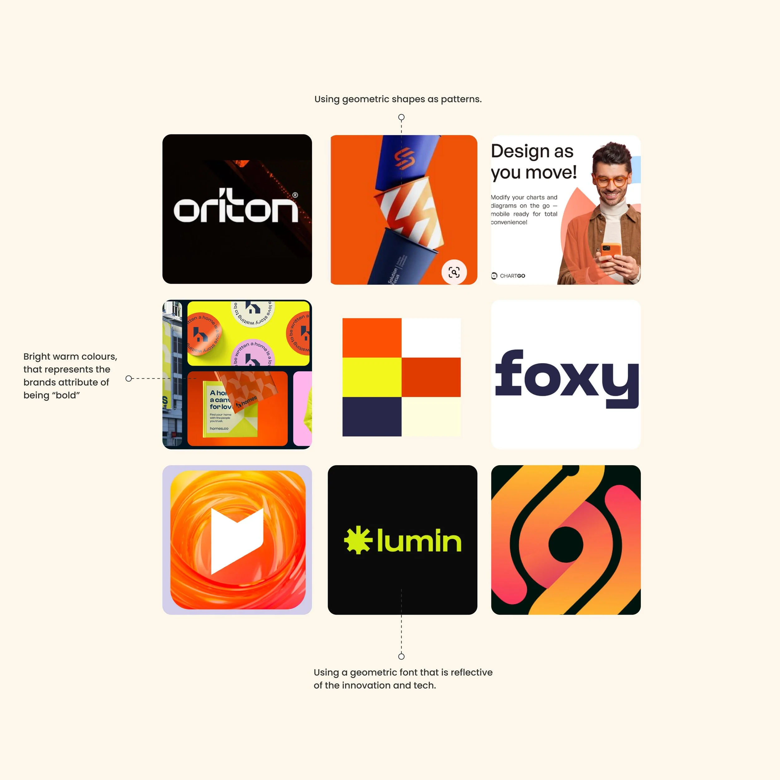
Based on the brand strategy being defined we now draft directions of the brand tone and visual direction.
MoodboardBRAND WORDSSolution-based
Innovative
Forward-thinking
Bold
First Round of Logos
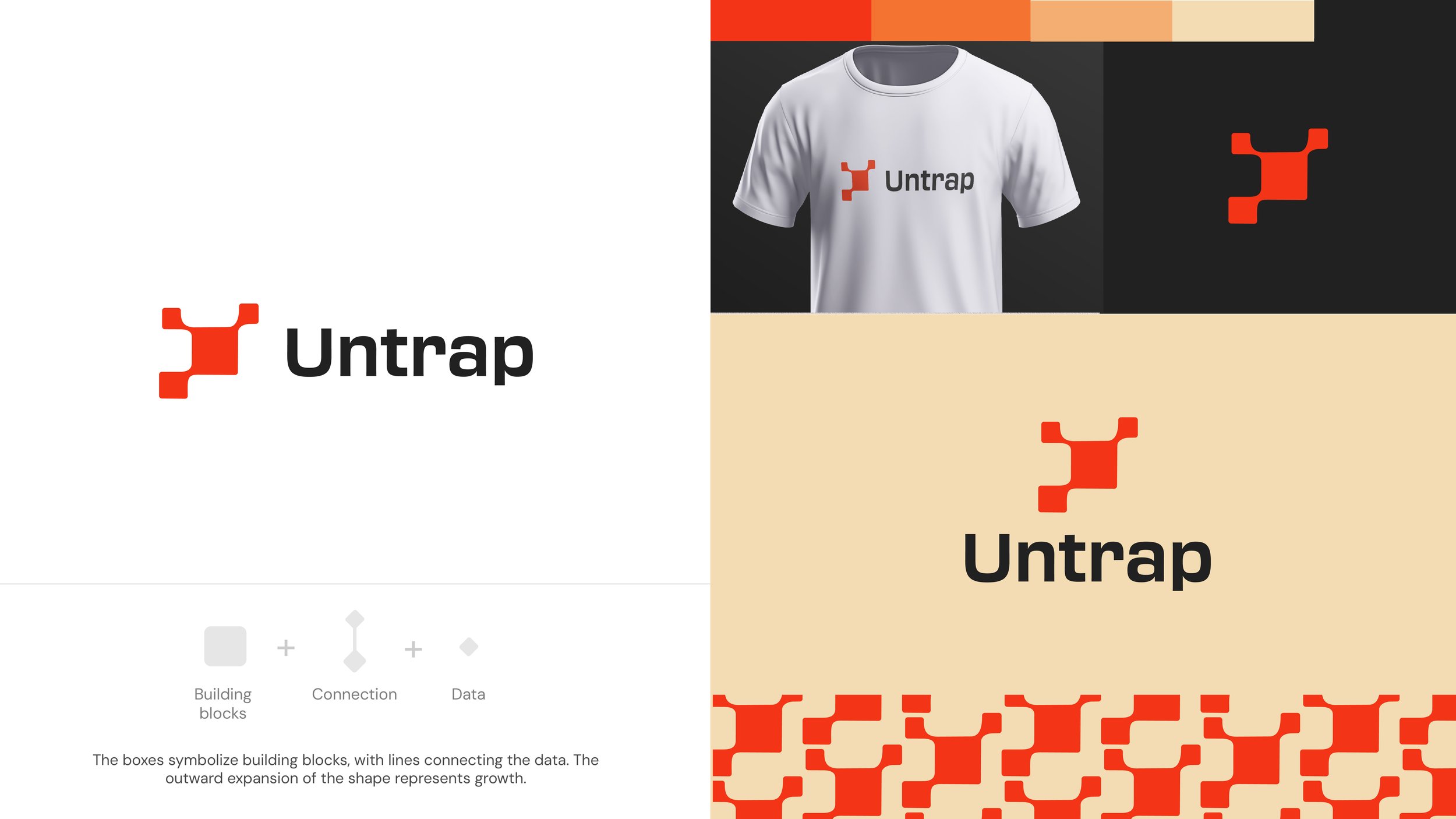
Option One
The boxes symbolize building blocks, with lines connecting the data points. The outward expansion represents growth.
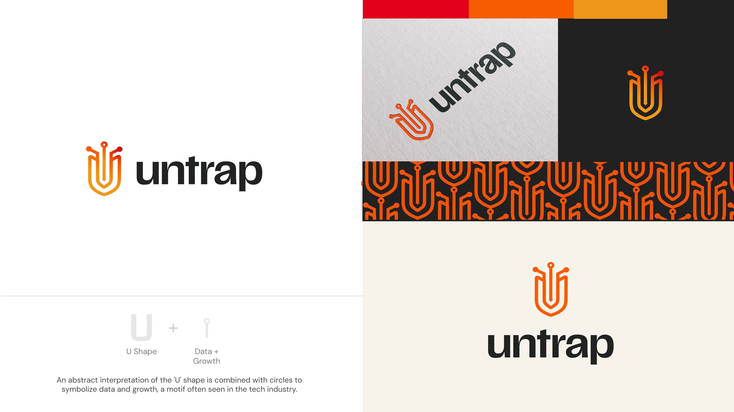
Option Two
An abstract representation of the “U” shape is combined with the circles to symbolize data and growth.
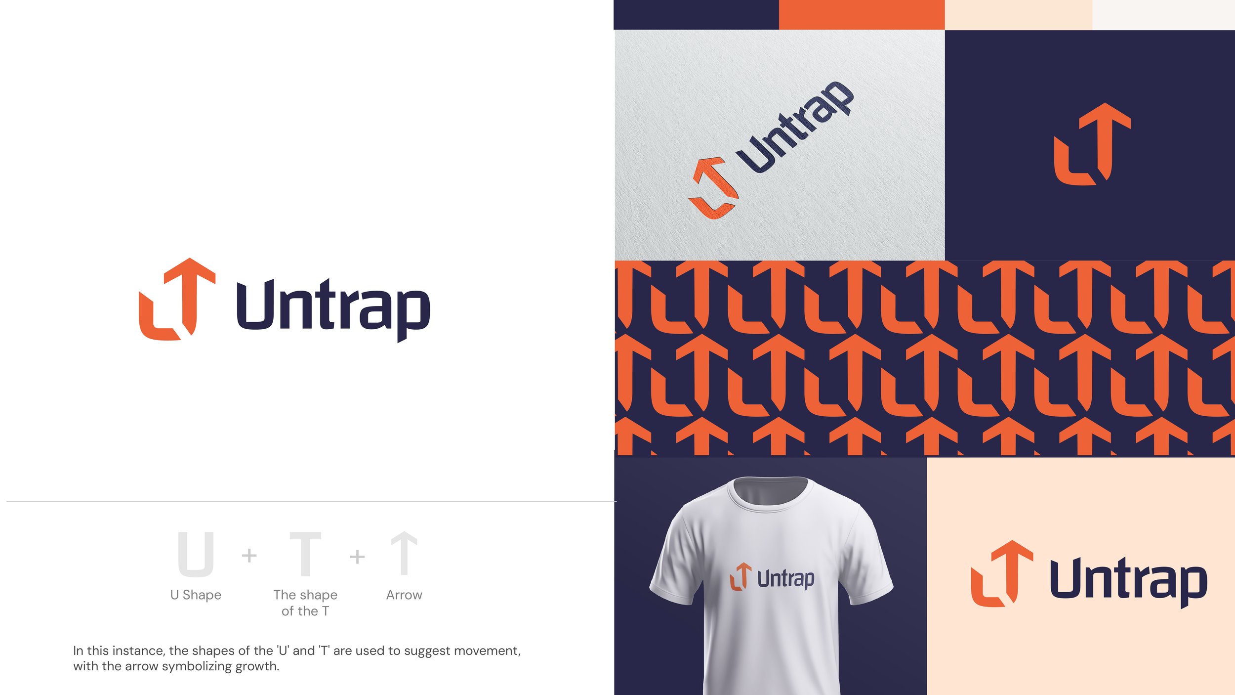
Option Three
The shapes of the “U” and “T” are used to suggest movement, with the arrow symbolizing growth.
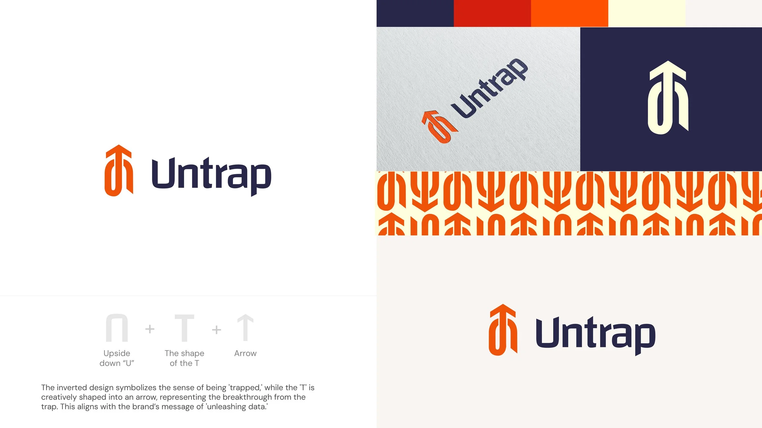
Option Four
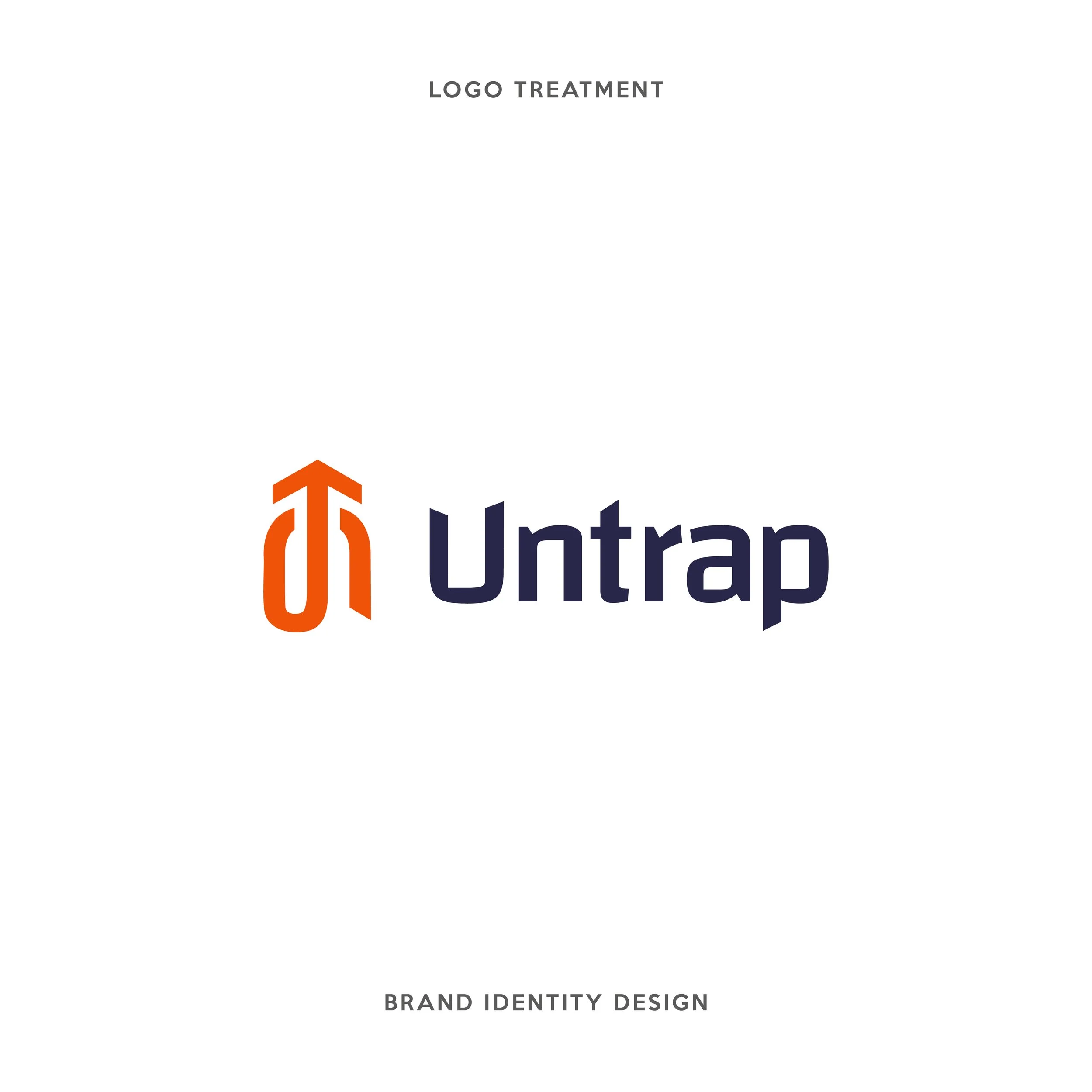
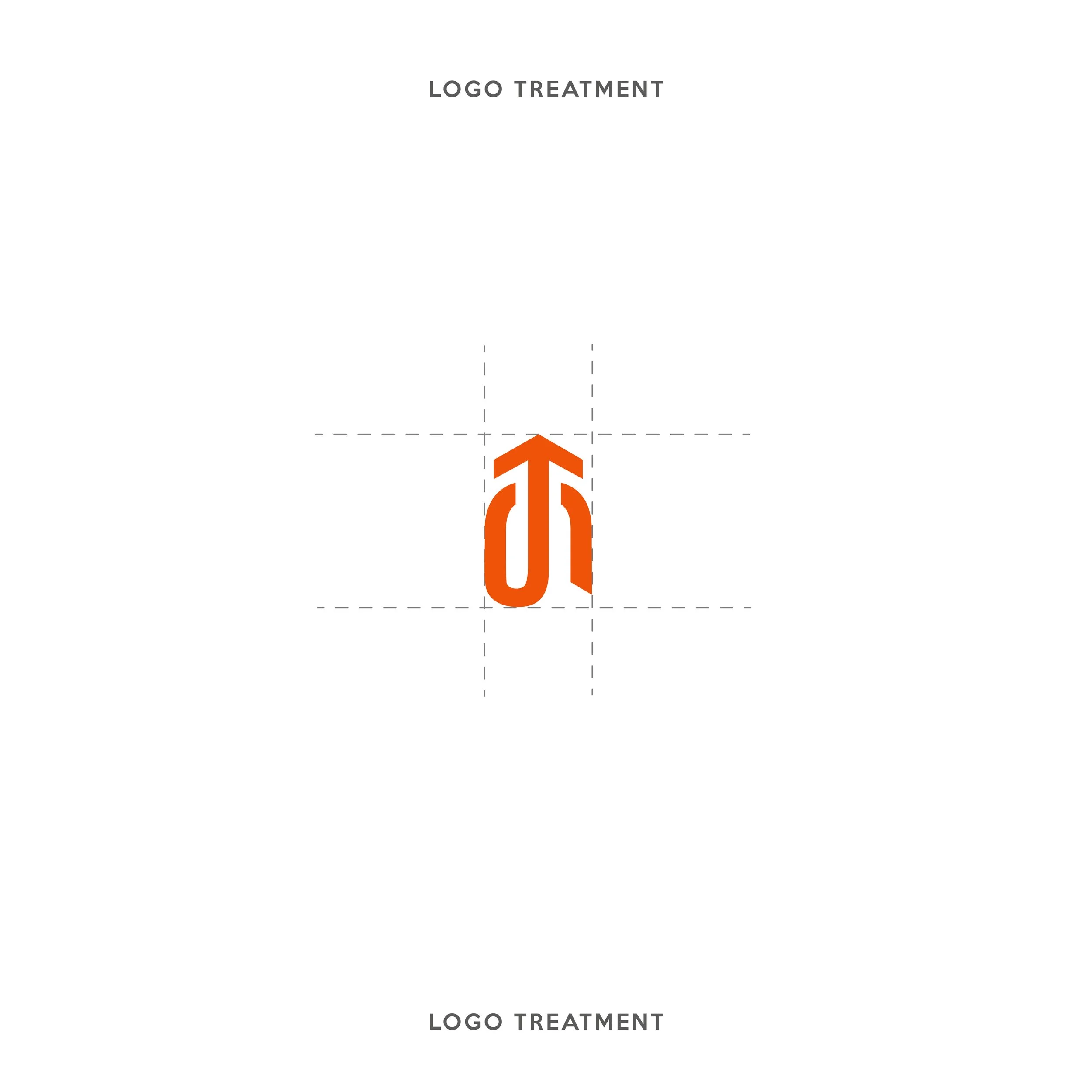
This was the chosen winner with a few refinements. The inverted design of the U symbolizes the sense of data being “trapped,” while the ‘T’ is creatively shaped into an arrow. This is representing the breakthrough from the trap. This aligns with the brand’s messaging of “unleashing data.”
Final Logo